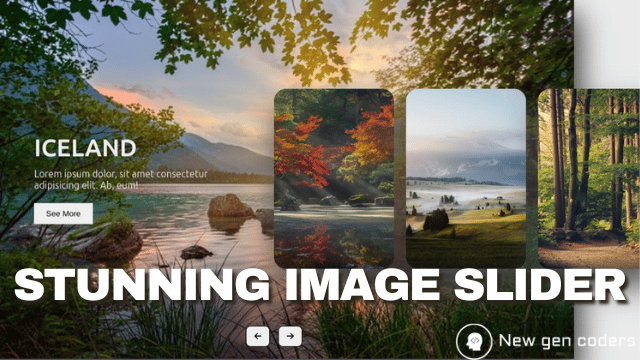
Travel Destinations Image Slider
- Nov 13, 2024
- 26

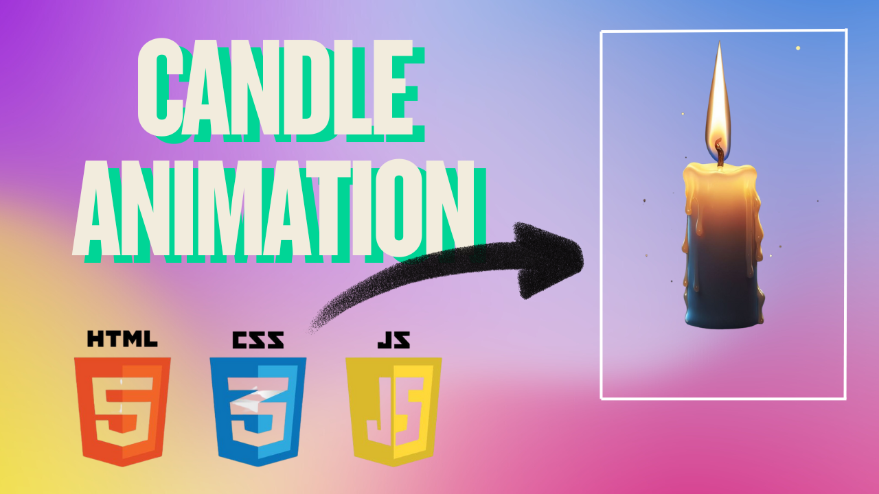
We'll demonstrate how to create a candle animation that produces a serene and lifelike flickering flame effect using basic HTML, CSS, and JavaScript. This project is perfect for beginners who want to experiment with web animations and light effects without using complex frameworks.
How to Design:
HTML Setup: Create a basic structure using
<div>elements for the candle’s body, wick, and flame.
CSS Styling: Style the candle with gentle gradients and rounded edges for a natural wax appearance. Animate the flame with
@keyframesandradial-gradientto simulate smooth flickering.
JavaScript Effects: Use a short script to randomly vary the flame’s
opacityandscaleevery few milliseconds. This creates a soft, realistic flicker that makes the candle appear alive and glowing against a dark background.
<!DOCTYPE html>
<html lang="en">
<head>
  <meta charset="UTF-8">
  <meta http-equiv="X-UA-Compatible" content="IE=edge">
  <meta name="viewport" content="width=device-width, initial-scale=1.0">
  <title>Candle Animation</title>
  <link rel="stylesheet" href="style.css">
</head>
<body>

  <div class="wrapper">
    <div class="candles">

      <div class="light__wave"></div>

      <!-- ========== Candle 1 ========== -->
      <div class="candle1">
        <div class="candle1__body">
          <div class="candle1__eyes">
            <span class="candle1__eyes-one"></span>
            <span class="candle1__eyes-two"></span>
          </div>
          <div class="candle1__mouth"></div>
        </div>
        <div class="candle1__stick"></div>
      </div>

      <!-- ========== Candle 2 ========== -->
      <div class="candle2">
        <div class="candle2__body">
          <div class="candle2__eyes">
            <div class="candle2__eyes-one"></div>
            <div class="candle2__eyes-two"></div>
          </div>
        </div>
        <div class="candle2__stick"></div>
      </div>

      <div class="candle2__fire"></div>
      <div class="sparkles-one"></div>
      <div class="sparkles-two"></div>
      <div class="candle__smoke-one"></div>
      <div class="candle__smoke-two"></div>

    </div>

    <div class="floor"></div>
  </div>

</body>
</html>
 body {
  background-color: #FEF4AD;
  animation: change-background 3s infinite linear;
}

.wrapper {
  position: absolute;
  left: 50%;
  top: 70%;
  transform: scale(1.5, 1.5) translate(-50%, -50%);
}

.floor {
  position: absolute;
  left: 50%;
  top: 50%;
  width: 350px;
  height: 5px;
  background: #673C63;
  transform: translate(-50%, -50%);
  box-shadow: 0px 2px 5px #111;
  z-index: 2;
}

.candles {
  position: absolute;
  left: 50%;
  top: 50%;
  width: 250px;
  height: 150px;
  transform: translate(-50%, -100%);
  z-index: 1;
}

.candle1 {
  position: absolute;
  left: 50%;
  top: 50%;
  width: 35px;
  height: 100px;
  background: #fff;
  border: 3px solid #673C63;
  border-bottom: 0px;
  border-radius: 3px;
  transform-origin: center right;
  transform: translate(60%, -25%);
  box-shadow: -2px 0px 0px #95c6f2 inset;
  animation: expand-body 3s infinite linear;
}

.candle1__stick, .candle2__stick {
  position: absolute;
  left: 50%;
  top: 0%;
  width: 3px;
  height: 15px;
  background: #673C63;
  border-radius: 8px;
  transform: translate(-50%, -100%);
}

.candle2__stick {
  height: 12px;
  transform-origin: bottom center;
  animation: stick-animation 3s infinite linear;
}

.candle1__eyes, .candle2__eyes {
  position: absolute;
  left: 50%;
  top: 0%;
  width: 35px;
  height: 30px;
  transform: translate(-50%, 0%);
}

.candle1__eyes-one {
  position: absolute;
  left: 30%;
  top: 20%;
  width: 5px;
  height: 5px;
  border-radius: 100%;
  background: #673C63;
  transform: translate(-70%, 0%);
  animation: blink-eyes 3s infinite linear;
}

.candle1__eyes-two {
  position: absolute;
  left: 70%;
  top: 20%;
  width: 5px;
  height: 5px;
  border-radius: 100%;
  background: #673C63;
  transform: translate(-70%, 0%);
  animation: blink-eyes 3s infinite linear;
}

.candle1__mouth {
  position: absolute;
  left: 40%;
  top: 20%;
  width: 0px;
  height: 0px;
  border-radius: 20px;
  background: #673C63;
  transform: translate(-50%, -50%);
  animation: uff 3s infinite linear;
}

.candle__smoke-one {
  position: absolute;
  left: 30%;
  top: 50%;
  width: 30px;
  height: 3px;
  background: grey;
  transform: translate(-50%, -50%);
  animation: move-left 3s infinite linear;
}

.candle__smoke-two {
  position: absolute;
  left: 30%;
  top: 40%;
  width: 10px;
  height: 10px;
  border-radius: 10px;
  background: grey;
  transform: translate(-50%, -50%);
  animation: move-top 3s infinite linear;
}

.candle2 {
  position: absolute;
  left: 20%;
  top: 65%;
  width: 42px;
  height: 60px;
  background: #fff;
  border: 3px solid #673C63;
  border-bottom: 0px;
  border-radius: 3px;
  transform: translate(60%, -15%);
  transform-origin: center right;
  box-shadow: -2px 0px 0px #95c6f2 inset;
  animation: shake-left 3s infinite linear;
}

.candle2__eyes-one {
  position: absolute;
  left: 30%;
  top: 50%;
  width: 5px;
  height: 5px;
  display: inline-block;
  border: 0px solid #673C63;
  border-radius: 100%;
  float: left;
  background: #673C63;
  transform: translate(-80%, 0%);
  animation: changeto-lower 3s infinite linear;
}

.candle2__eyes-two {
  position: absolute;
  left: 70%;
  top: 50%;
  width: 5px;
  height: 5px;
  display: inline-block;
  border: 0px solid #673C63;
  border-radius: 100%;
  float: left;
  background: #673C63;
  transform: translate(-80%, 0%);
  animation: changeto-greater 3s infinite linear;
}

.light__wave {
  position: absolute;
  top: 35%;
  left: 35%;
  width: 75px;
  height: 75px;
  border-radius: 100%;
  z-index: 0;
  transform: translate(-25%, -50%) scale(2.5, 2.5);
  border: 2px solid rgba(255, 255, 255, 0.2);
  animation: expand-light 3s infinite linear;
}

.candle2__fire {
  position: absolute;
  top: 50%;
  left: 40%;
  display: block;
  width: 16px;
  height: 20px;
  background-color: red;
  border-radius: 50% 50% 50% 50%/60% 60% 40% 40%;
  background: #FF9800;
  transform: translate(-50%, -50%);
  animation: dance-fire 3s infinite linear;
}

@keyframes blink-eyes {
  0%, 35% {
    opacity: 1;
    transform: translate(-70%, 0%);
  }
  36%, 39% {
    opacity: 0;
    transform: translate(-70%, 0%);
  }
  40% {
    opacity: 1;
    transform: translate(-70%, 0%);
  }
  50%, 65% {
    transform: translate(-140%, 0%);
  }
  66% {
    transform: translate(-70%, 0%);
  }
}
@keyframes expand-body {
  0%, 40% {
    transform: scale(1, 1) translate(60%, -25%);
  }
  45%, 55% {
    transform: scale(1.1, 1.1) translate(60%, -28%);
  }
  60% {
    transform: scale(0.89, 0.89) translate(60%, -25%);
  }
  65% {
    transform: scale(1, 1) translate(60%, -25%);
  }
  70% {
    transform: scale(0.95, 0.95) translate(60%, -25%);
  }
  75% {
    transform: scale(1, 1) translate(60%, -25%);
  }
}
@keyframes uff {
  0%, 40% {
    width: 0px;
    height: 0px;
  }
  50%, 54% {
    width: 15px;
    height: 15px;
    left: 30%;
  }
  59% {
    width: 5px;
    height: 5px;
    left: 20%;
  }
  62% {
    width: 2px;
    height: 2px;
    left: 20%;
  }
  67% {
    width: 0px;
    height: 0px;
    left: 30%;
  }
}
@keyframes change-background {
  0%, 59%, 98%, 100% {
    background: #FEF4AD;
  }
  61%, 97% {
    background: #F8AE39;
  }
}
@keyframes move-left {
  0%, 59%, 100% {
    width: 0px;
    left: 40%;
  }
  60% {
    width: 30px;
    left: 30%;
  }
  68% {
    width: 0px;
    left: 20%;
  }
}
@keyframes move-top {
  0%, 64%, 100% {
    width: 0px;
    height: 0px;
    top: 0%;
  }
  65% {
    width: 10px;
    height: 10px;
    top: 40%;
    left: 40%;
  }
  80% {
    width: 0px;
    height: 0px;
    top: 20%;
  }
}
@keyframes shake-left {
  0%, 40% {
    left: 20%;
    transform: translate(60%, -15%);
  }
  50%, 54% {
    left: 20%;
    transform: translate(60%, -15%);
  }
  59% {
    left: 20%;
    transform: translate(60%, -15%);
  }
  62% {
    left: 18%;
    transform: translate(60%, -15%);
  }
  65% {
    left: 21%;
    transform: translate(60%, -15%);
  }
  67% {
    left: 20%;
    transform: translate(60%, -15%);
  }
  75% {
    left: 20%;
    transform: scale(1.15, 0.85) translate(60%, -15%);
    background: #fff;
    border-color: #673C63;
  }
  91% {
    left: 20%;
    transform: scale(1.18, 0.82) translate(60%, -10%);
    background: #F44336;
    border-color: #F44336;
    box-shadow: -2px 0px 0px #F44336 inset;
  }
  92% {
    left: 20%;
    transform: scale(0.85, 1.15) translate(60%, -15%);
  }
  95% {
    left: 20%;
    transform: scale(1.05, 0.95) translate(60%, -15%);
  }
  97% {
    left: 20%;
    transform: scale(1, 1) translate(60%, -15%);
  }
}
@keyframes stick-animation {
  0%, 40% {
    left: 50%;
    top: 0%;
    transform: translate(-50%, -100%);
  }
  50%, 54% {
    left: 50%;
    top: 0%;
    transform: translate(-50%, -100%);
  }
  59% {
    left: 50%;
    top: 0%;
    transform: translate(-50%, -100%);
  }
  62% {
    left: 50%;
    top: 0%;
    transform: rotateZ(-15deg) translate(-50%, -100%);
  }
  65% {
    left: 50%;
    top: 0%;
    transform: rotateZ(15deg) translate(-50%, -100%);
  }
  70% {
    left: 50%;
    top: 0%;
    transform: rotateZ(-5deg) translate(-50%, -100%);
  }
  72% {
    left: 50%;
    top: 0%;
    transform: rotateZ(5deg) translate(-50%, -100%);
  }
  74%, 84% {
    left: 50%;
    top: 0%;
    transform: rotateZ(0deg) translate(-50%, -100%);
  }
  85% {
    transform: rotateZ(180deg) translate(0%, 120%);
  }
  92% {
    left: 50%;
    top: 0%;
    transform: translate(-50%, -100%);
  }
}
@keyframes expand-light {
  10%, 29%, 59%, 89% {
    transform: translate(-25%, -50%) scale(0, 0);
    border: 2px solid rgba(255, 255, 255, 0);
  }
  90%, 20%, 50% {
    transform: translate(-25%, -50%) scale(1, 1);
  }
  95%, 96%, 26%, 27%, 56%, 57% {
    transform: translate(-25%, -50%) scale(2, 2);
    border: 2px solid rgba(255, 255, 255, 0.5);
  }
  0%, 28%, 58%, 100% {
    transform: translate(-25%, -50%) scale(2.5, 2.5);
    border: 2px solid rgba(255, 255, 255, 0.2);
  }
}
@keyframes dance-fire {
  59%, 89% {
    left: 40%;
    width: 0px;
    height: 0px;
  }
  90%, 0%, 7%, 15%, 23%, 31%, 39%, 47%, 55% {
    left: 40.8%;
    width: 16px;
    height: 20px;
    background: #FFC107;
  }
  94%, 3%, 11%, 19%, 27%, 35%, 43%, 51%, 58% {
    left: 41.2%;
    width: 16px;
    height: 20px;
    background: #FF9800;
  }
}
@keyframes changeto-lower {
  0%, 70%, 90% {
    padding: 0px;
    display: inline-block;
    border-radius: 100%;
    background: #673C63;
    border-width: 0 0 0 0;
    border: 0px solid #673C63;
    transform: translate(-90%, 0%);
  }
  71%, 89% {
    background: none;
    border: solid #673C63;
    border-radius: 0px;
    border-width: 0 2px 2px 0;
    display: inline-block;
    padding: 1px;
    float: left;
    transform-origin: bottom left;
    transform: rotate(-45deg) translate(-50%, -65%);
    -webkit-transform: rotate(-45deg) translate(-50%, -65%);
  }
}
@keyframes changeto-greater {
  0%, 70%, 90% {
    top: 50%;
    padding: 0px;
    display: inline-block;
    border-radius: 100%;
    background: #673C63;
    border-width: 0 0 0 0;
    border: 0px solid #673C63;
    transform: translate(-80%, 0%);
  }
  71%, 89% {
    top: 30%;
    background: none;
    border: solid #673C63;
    border-radius: 0px;
    border-width: 0 2px 2px 0;
    display: inline-block;
    padding: 1px;
    float: left;
    transform-origin: bottom left;
    transform: rotate(135deg) translate(-80%, 20%);
    -webkit-transform: rotate(135deg) translate(-80%, 20%);
  }
}
Leave Comments